Ally's Behind the Scenes Take: Rebranding & Redesigning the Website
You might have noticed that The Norman Sicily Project’s website has recently undergone a lot of changes. Over the past few months, we’ve been working on creating a new interface for the site. Here’s a little behind the scenes of how we did everything.
First Things First
The first thing you should have when redesigning a website is a goal. What do you want from the new site? What can be improved upon from the current site? With The Norman Sicily Project, we wanted better accessibility and a better interface. These improvements would bring activity to the site and educate people about Sicily’s Norman past, which is the main goal of the project. Here’s some of the feedback we used to make changes to the site:
- Make the site simpler.
- Make the site more accessible.
- Make the site more attractive.
- Make the site compatible with mobile devices.
- Make it possible forto people to contact us.
- Improve data integration.
What Went Down
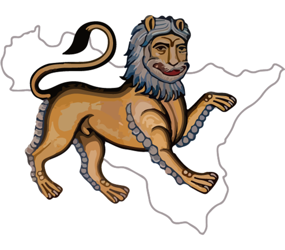
Before even beginning to redesign the site, we needed to do a little rebranding. The project needed a new recognizable logo. To achieve this, we stylized an image of a lion mosaic made during the period with an outline of Sicily behind it.
We’ve been increasing our social media presence by posting weekly on Instagram, Facebook, and X. There’s also the new addition of this blog to the website. When looking at a website with as much data as The Norman Sicily Project has, it can be easy to forget there are people behind it who’ve worked really hard to make it all possible. This blog will hopefully allow viewers to read and learn about the experiences of the people behind the project.
Now for the site redesign – this was the biggest part of the rebrand. Using the feedback that was mentioned earlier, we spent about a month making mockups on Photoshop. The first thing we had to do was decide on a theme – what colors and fonts did we want, and did they work well together? These decisions seem so simple but actually took us a while to figure out. For the first mockups, the site’s background color was taken directly from the logo. It ended up being a bit dark, which wasn’t so great for accessibility. From there, we tried a variety of lighter shades until ultimately choosing plain ol’ white. The new site uses 2 fonts, one themed and one plain. The medieval looking font was chosen to go with the time period the project covers. To make the main body of the site clear and easy to read, we chose a simple font for the paragraph text.
The new page designs are super easy to navigate. The tabs in the menu bar at the top clearly state the contents of each page. We got rid of some pages, like Chattels, which would have complicated user experience on the site. We also combined the Analytics, Resources, and Essays pages. They were consolidated into one big Resources page with pretty much all the information that wasn’t included on the other pages of the site. We added a Contact page with a submission form that allows everyone to communicate with us. This was a very important addition since there’s valuable information that can come from non-scholarly sources.
It’s really great to look at the website knowing everything that went into it. Every little change made a huge difference and the site has a completely different feel now. It’s so much easier to get to all the information and see everything The Norman Sicily Project has to offer. Thanks for reading!
